Showing posts with label 2001 tour. Show all posts

Saturday, September 25, 2010

Edizioni di Milano

From Roxy Art

From Roxy Art

Hmmmm. Good eye, awkward hands? I assume this was assembled for private trading. I do like the layout, but there's a lot of image stretching and artifact issues with the images, making this something of a well-intentioned failure. Nice choice of fonts, anyway.

Wednesday, September 22, 2010

At the Pavilion

From Roxy Art

From Roxy Art

I really like this design that I did. The problem was that a certain so-called Mechanibax passed along a tape of Roxy's 2001 DC show with apologies for the damage to two tracks. For the resulting album, tracks were inserted from Strimpldisc's recording of the first night in NYC three days later.

The cover photo was from Vanity Fair's 2001 "The Music Issue." It's one of my all-time favorite pics of Bry and I think it makes a darn good album cover. Here, I inverted the usual album tradition and put Bry on the front and a girl - Milla Jovovich, I think - on the back. Turns out this is one of my favorite designs, in part because of the unintentional match in tone and shade between the two images. It's a design that required minimal fiddling.

Out of the Sky Came the Sun

From Roxy Art

From Roxy Art

This is another one that I did anonymously.

Earlier in the blog, I mentioned that a copy of Laughing Cow Records's bootleg of Roxy's 2001 Atlanta show had been purchased, by a fellow fan, from a record store in Marietta. She wanted to redistribute it but wanted new artwork and asked me to take it from there.

What I didn't mention earlier is that Laughing Cow's copy of Atlanta show, despite its slack set list, is, by a nose, the best-quality "audience" tape from this tour. It was suggested that it's an "ALD" tape, though at least one fan disputed that. Whichever, it was definitely a tape that deserved to circulate. I suggested using the same picture of Bry that Laughing Cow had used on the front cover, just in case the Laughing Cow guys ever saw it and were amused or annoyed by my cheek. The Atlanta skyline is disagreeably low-res, but was the best that I had available at the time. Back cover photos were from Phil's site.

There is, incidentally, another audience tape of this show, distributed (and allegedly taped) by Breadfruit Obsauditory. It goes by the name Downs 'Outh and is of much lower quality than Cow's. It also contains far too many drunken season-ticket yahoos from the table next to the taper. If you live in the area and know that this was recorded at Chastain Park, you probably aren't too shocked to read that.

Friday, September 17, 2010

Twin Disc from Twin Cities

From Roxy Art

From Roxy Art

Here's a case where Mr. Monopoly barged in and made a new back cover for somebody else's show. It was one of those less inspiring mid-USA shows without the the four "sometimes played" songs that everybody wanted to hear (Seriously, it's lacking "If There is Something" AND "Mother of Pearl" AND "Virginia Plain" AND "More Than This"...? Does Minneapolis have a curfew?), but the taper's skill in getting a good recording was... not matched by their design skills. With the taper's permission, Mr. Monopoly made a new back cover with the thanks of a grateful ego.

Live 2001

This is an anonymous design for a single-disc compilation of material from two sources.

From Roxy Art

From Roxy Art

What an odd little collection. It's eleven songs from Sydney and the five songs from the band's appearance on Top of the Pops 2 that predated the tour.

I don't have any information about this disc or the design, except that I don't think much of that cheesy airbrush girl on the front, and I might consider killing a man to get that jacket Bry's wearing on the interior shot of him, Phil and Andy.

This disc was spotted on eBay a few times in 2001-02.

Thursday, September 16, 2010

Leben und Kunst of Roxy Music

From Roxy Art

From Roxy Art

Another anonymous contribution. Somebody else was learning PhotoShop filters on this tour.

The designer of this sleeve credits the fan site www.vivaroxymusic.com as the source for the photos. Another anonymously made sleeve, for A Really Good Tyne used the same photo on its back cover. Who can blame 'em? It's a terrific photo.

As the truncated set list indicates, this is taken from a concert transmitted by a German radio station. It was treed towards the end of 2001, by which time I recall many fans suffering from a little CD-R fatigue wondering whether to bother collecting all these shows or not. The broadcast suffered from the German hosts talking all the heck over the end of "Do the Strand."

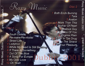
...great to be back...

From Roxy Art

From Roxy Art

No idea who made this one, although the choice of fonts suggest that it might have been a European fan called H.S. One thing strikes me and that's the unusual image stretching on the back cover. In designing and laying out these things and learning how to make an image the right size, that's an easy lesson to learn. Also note the choice in how to make white text stand out on Bry's white shirt. Did they actually intend to use a different font?

Everyone's Ideal

One of two known 2001 tour designs by Strimpldisc. Make no mistake: this guy was awesome.

From Roxy Art

From Roxy Art

These scans don't do Strimpldisc's work justice. The booklet was actually an eight-page double-sided affair on glossy, slick, heavy paper, and he was among the first 'leggers to print directly onto CD-Rs. Suffice it to say that those of us expecting two discs in an envelope and two attached jpegs in an email were knocked on our socks when we opened our padded envelopes and saw the work he put into his releases.

Of all the CD-R boots that I saw of the 2001 tour, there were three which were amazingly impressive, two of Strimpldisc's and one from Australia I'll share later. Mr. Monopoly's best sleeve was a pretty distant fourth.

Strimpldisc shared that he made a dozen "deluxe edition" copies of his two releases that year. This was the second; the Chicago 2001 show the first. They're among the best treasures of my collection.

Diamonds are Forever

This is another Mr. Monopoly design, this one commissioned by another fan.

From Roxy Art

From Roxy Art

Mr. Monopoly honestly doesn't remember any of the details of this commission, or what the fan asked for, but "the Abcess Recording Company, Holland" was probably the identity of that other fan. Evidently Mr. Monopoly was discovering how to play with filters and layers that week. The image on the back cover probably has something to do with diamonds. The cover model is Playmate Heather Spytek.

When Autumn Falls

Here is an anonymous sleeve, but it reminds me of what Reklaw Records were making around this time.

From Roxy Art

From Roxy Art

The text-heavy back cover, and the use of the full spine, also reminds me of the sleeve for As the Lights Go Down. Perhaps it was made by the same person.

This is Roxy Music

The BBC broadcast of Roxy's June 2001 show set up dozens of bootleg trees and at least two for-sale boots. One of these would, memorably, be completely botched by whatever studio mastered it and have a bonus track replacing one of the songs from the concert. But before the profiteers had their copies in distribution, a fan called H.S. had this instantly memorable sleeve passing around fandom.

From Roxy Art

From Roxy Art

It's the model Sophie Dahl from a Yves Saint Laurent Opium campaign that piled up complaint after complaint from the public in October and November 2000. Hats off to H.S., as that is a classic image for Roxy.

Now that back cover is not the original one. H.S.'s creation had a close-up on Sophie's foot and a simple repeat of the inside front cover's track listing. Mr. Monopoly was asked to step in by another fan to do a different back cover. This he did, pilfering an image from that show from a fan site. Unfortunately, I do not have the original back cover any longer, so you'll have to make do with this.

Sayonara Moon

An anonymous design, whomever assembled this one seems to have prefered Bry's look in the 1970s. That pencil sketch image used for the moon is from the "This is Tomorrow" single sleeve, I think.

From Roxy Art

From Roxy Art

This also bucks the hobby trend of listing the song titles on the back cover. Note also the misaligned text on the spines. That always aggravates me when people don't take the time to center those.

A Really Good Tyne

Another anonymous design, this time for a 2001 tour show. The goofy pun (the Tyne is the river that runs through Newcastle, where this was recorded) doesn't really limit the number of potential suspects.

From Roxy Art

From Roxy Art

The front cover is almost a good one, but it's not executed very well. The goth girl model has the right look, but all those layers on the inside cover look horrible. The back cover is much better. That's a good photo and it's laid out very well.

Probably assembled for private swapping; I have no evidence this was treed or publicly offered anywhere.

Wednesday, September 15, 2010

LiveGlasgow29.09.01

Here is another Mr. Monopoly design, this one of Roxy's second appearance in Glasgow when they returned to the UK for the final four or five shows of the 2001 tour.

From Roxy Art

From Roxy Art

The text is a very quirky and odd "no spaces" choice done in what appears to be carbonated gothic. Mr. Monopoly recalls that he had designed three and a half sleeves for the 2001 tour prior to this, one of these remaking another fan's back cover with modified text. Of the others, one was an attempt at comedy, making a CD sleeve like a beer label, one was a photo of Ferry and Eno (of which he remains very proud) and one was the City of Angels cover with the half-naked model. Nevertheless, he was called out, jokingly, by a fellow fan as always having naked girls on his sleeve and so he agreed that his next effort would attempt to be something different.

The result squeezes the maximum possible use out of a single publicity photo by Kevin Westerberg. In retrospect, it is perhaps odd that more use was not made of publicity photos by designers, rather than regular re-use of blurry sixth row camera shots. On the other hand, there were aggravatingly few publicity photos available from that tour.

Why the text is all run together like that, however, nobody can say.

This design is not believed to have been treed or weeded, and should never have been sold.

Downtown Life

This is an incredibly odd sleeve, and one unlike any other seen in the archives of bootleg Bry and Roxy sleeves.

From Roxy Art

From Roxy Art

It is a work by kudzu, who is known to have designed many sleeves for Tori Amos and Madonna ROIOs along with at least one Bry album, and deliberately evokes early 1980s video games. Even the very blocky font on the back suggests an Atari 2600.

The information here is minimal and the colors are flat. Personally, I think it's a shame that there's so little text on it, or that kudzu didn't include more visual information to either personalize it or make it look or feel either like a bootleg or like an official album never before seen.

This artwork is not known to have been distributed in any way other than friendly trading.

City of Angels

One of five albums designed by Mr. Monopoly and his then-wife Tatiana to be traded under the POPocalypse banner.

From Roxy Art

From Roxy Art

Each of the five albums was given a different pun title to reflect the location of its recording (here, Los Angeles). Each used three pictures of a new Roxy girl from the same photo session (with one exception to be noted later). This model is Jennifer Sky, photographed by Isabel Snyder for (apparently) Stuff magazine.

Design across the five titles was identical, with only the name ROXY MUSIC on the front (as on the first five Roxy studio albums). The inside front image used a different solid background color, with the album title, recording date and personnel on the left, and details about the model on the right. The back cover of each CD is also standard, with a simple font and a black and white photo of the album's Roxy girl. The "eight-channel hypnotransistorized sound" disclaimer was standard across all fourteen POPocalypse free releases, not just the Roxy Music ones, and was written in tribute to the liner notes of Hillbilly Frankenstein's classic album Hypnotica!

At least ten copies of this CD were assembled for friends and members of the POPocalypse CD Club. This artwork was never noticed on a copy for sale anywhere.

7/26/01 - Chastain Park, Atlanta GA.

An interesting purchase made from a Marietta record store about two months after the show. The label, Laughing Cow, was used for dozens of recordings made at various Atlanta venues. Prices for their CD-Rs were very, very high: $30-45 were seen on various single and double-disc issues on bright blue CD-Rs with paper labels.

From Roxy Art

From Roxy Art

No concrete facts can be written about the Laughing Cow label. It was thought curious by many local music buyers that their line, which started at least as early as 1994 with a Tori Amos concert recorded at the Variety Playhouse, would always turn up at one or two certain music stores, but what inquiries were made didn't result in honest answers. It was alleged that at least one store would trade Laughing Cow CD-Rs straight across for certain other labels' work.

By 2004, Laughing Cow seemed to be dead, done in by the ubiquity of home CD burners and print-to-disc labeling. Around the same time, a certain CD store had to shutter its large space and relocate to something much smaller, without a street-facing storefront. It was noted that the number of unofficial CDs sold in this establishment had dwindled away to nearly nothing, despite previously offering dozens of Laughing Cow titles for the prices named above, and yet the propreitor suggested that Napster was the main culprit.